For information about acceptable uses or other questions, please contact University Communications at ucomm@wittenberg.edu.
The following are the official identity marks of Wittenberg University. Please complete the following form to secure permission to use. Links below each thumbnail link to a high resolution JPEG, a PNG with transparency, and a true EPS (vector file, scalable). To download: Right-click (Win) or command-click (Mac) and select "Save File As..." "Save Link As..." or "Save As..." depending on your browser and operating system.
Need more information about guidelines related to Wittenberg University's unique brand identity?
University Marks
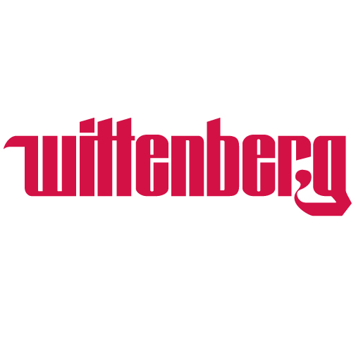
The Wittenberg Gothic Logo
 The Wittenberg Gothic Logo was designed by a typographer specifically for the university and unveiled in the early 1970s. This is the main university logo. The font is not available publicly, and should not be used for any purpose other than appearing as the Wittenberg Gothic Logo. The logo must never be truncated to appear as 'Witt'.
Acceptable Treatments: The logo can appear in red or white in color documents, red against a light background or white against a dark background. Black is acceptable only in black-and-white documents. The logo must not be violated by overlaid text or graphics, and all surrounding elements must be clear of the logo by 10% of its width. The logo must not be bisected, stretched, or otherwise manipulated in any fashion.
Downloadable Versions: JPEG > PNG > EPS
The Wittenberg Gothic Logo (Without 'University')
 The Wittenberg Gothic Logo sometimes appears without the word "University,",mainly when used on apparel where space is an issue. Many athletic jerseys employ the gothic logo without 'University'. This treatment should only be used in familiar settings where it is widely known or can be safely assumed that Wittenberg is an institution of higher education. The logo must never be truncated to appear as 'Witt'.
Acceptable Treatments: The logo can appear in red or white in color documents, red against a light background or white against a dark background. Black is acceptable only in black-and-white documents. The logo must not be violated by overlaid text or graphics, and all surrounding elements must be clear of the logo by 10% of its width. The logo must not be bisected, stretched, or otherwise manipulated in any fashion.
Downloadable Versions: JPEG > PNG > EPS
The Tiger Hug Logo
 The Tiger Hug logo features the Wittenberg mascot embracing the Flying W, symbolizing the pride, spirit, and sense of community that define the Wittenberg experience. This mark serves as a versatile, spirited graphic that may be used across campus by departments, programs, and student organizations when a more playful or energetic representation of Wittenberg is appropriate. Because it combines the mascot and the Flying W, it should be used as a complete graphic and must not be separated into individual elements.
Acceptable Treatments: The Tiger Hug logo should appear in its full-color version whenever possible. A one-color red, white, or black version may be used when production limitations require simplified color treatment. The mark must always maintain its original proportions and colors. The logo must not be violated by overlaid text or graphics, and all surrounding elements must be clear of the logo by at least 10% of its width. The logo must not be bisected, stretched, recolored outside of approved treatments, or otherwise manipulated in any fashion.
Downloadable Versions: JPEG > PNG > EPS
Athletics Marks
The "Winged W"
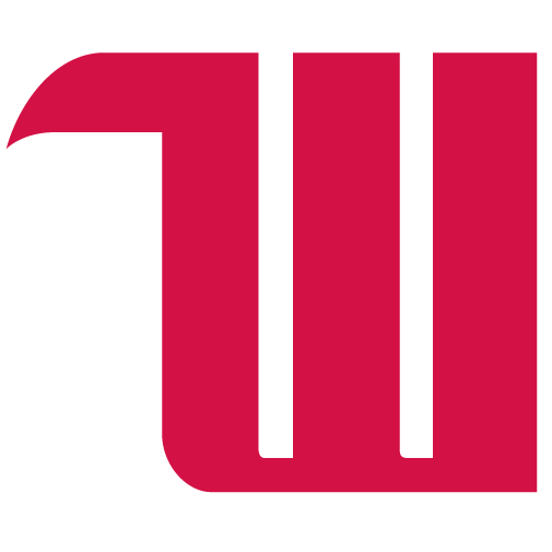 The 'Winged W' (sometimes referred to as the "Flying W") is the first letter of the Wittenberg Gothic logotype, used as an abbreviation for Wittenberg and present in many of the university's materials. The Winged W is an iconic representation of the university and unique to Wittenberg, and as such a distinctive mark, it is imperative that it not be abused in any way.
Acceptable Treatments: The Winged W always appears in one color, and may appear in color documents as red (PMS 200 solid uncoated) against a light background or white against a dark background. Black is an acceptable color only in black-and-white documents.
Design Considerations: Designers should consider the horizontal center of the Winged W to be centered within the middle ascender of the W, not the true, measured center. The "wing" moves the measured center to the left of the mark's visual center, and when centered by measurement, the W will appear off-center. To see an illustration of this effect, click here. In short, ignore the "wing" when centering the W.
The logo must not be violated by overlaid text or graphics, and all surrounding elements must be clear of the logo by 10% of its width. The logo must not be bisected, stretched, or otherwise manipulated in any fashion.
Downloadable Versions: JPEG > PNG > EPS
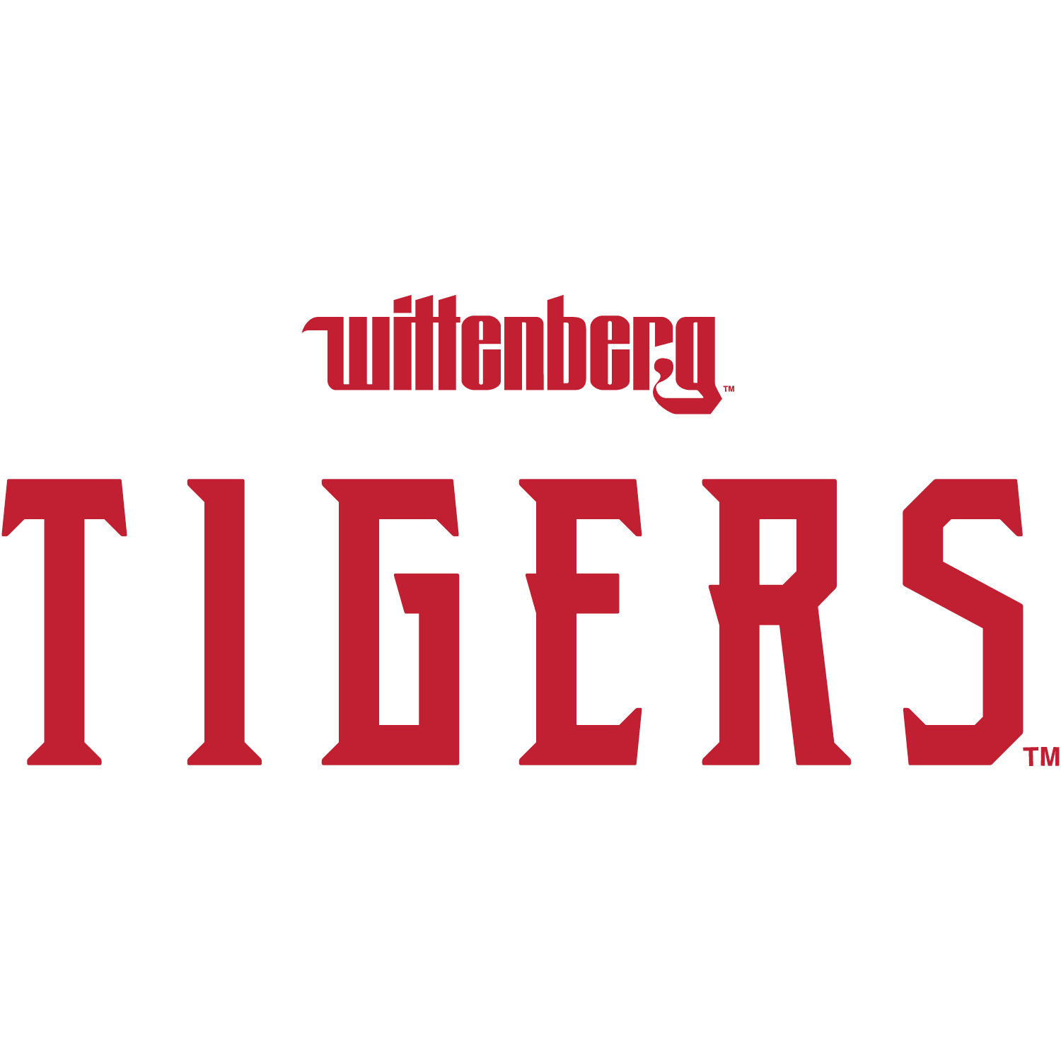
Wittenberg Athletics Logos - New in 2019
 This logo should be treated as the primary Wittenberg Athletics mark. Whenever a logo is needed to represent Wittenberg Athletics, the full Wittenberg Wordmark (below) or the Stacked-W+Tigers is the preferred choice for marketing materials.
The logo can appear in red or white in color documents, red against a light background or white against a dark background. Black is acceptable only in black-and-white documents. The logo must not be violated by overlaid text or graphics, and all surrounding elements must be clear of the logo by 10% of its width. The logo must not be bisected, stretched, or otherwise manipulated in any fashion.
Downloadable Versions: JPEG > PNG > EPS
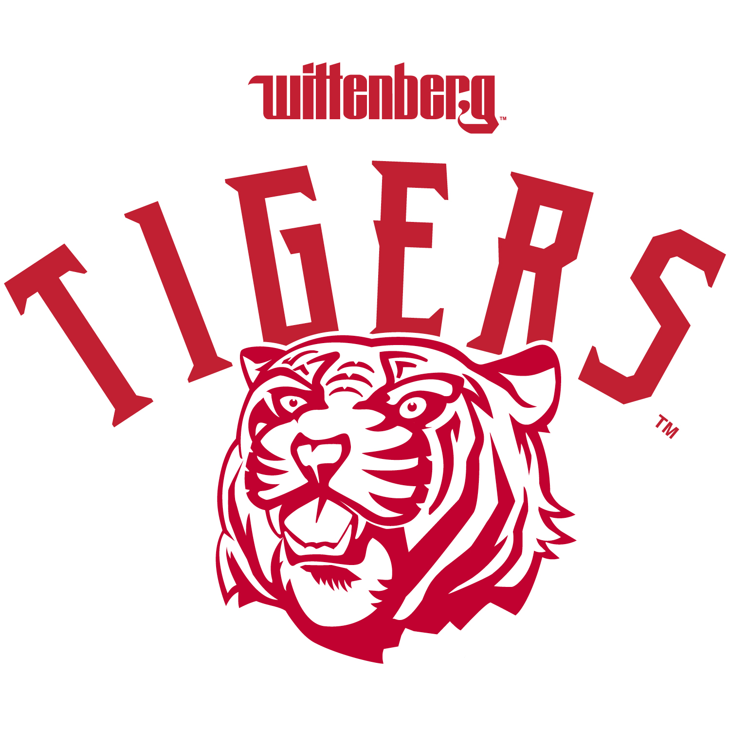
 This logo should be treated as the other primary Wittenberg Athletics mark. Whenever a logo is needed to represent Wittenberg Athletics, the full Wittenberg Wordmark or the Stacked-W+Tigers (above) is the preferred choice for marketing materials.
The logo can appear in red or white in color documents, red against a light background or white against a dark background. Black is acceptable only in black-and-white documents. The logo must not be violated by overlaid text or graphics, and all surrounding elements must be clear of the logo by 10% of its width. The logo must not be bisected, stretched, or otherwise manipulated in any fashion.
Downloadable Versions: JPEG > PNG > EPS
 This logo is preferred when able to use a full color lockup of all three elements. Because of the lockup’s complexity, the usage must be limited to specific cases in which it does not become crowded or should live alone. Its usage is mainly intended for apparel.
The logo can appear in red or white in color documents, red against a light background or white against a dark background. Black is acceptable only in black-and-white documents. The logo must not be violated by overlaid text or graphics, and all surrounding elements must be clear of the logo by 10% of its width. The logo must not be bisected, stretched, or otherwise manipulated in any fashion.
Downloadable Versions: JPEG > PNG > EPS
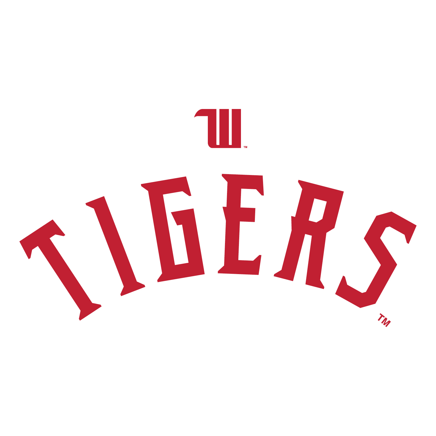 This stacked version is a more compact option of the W + Tigers coupling and should be used when space calls for a more horizontal version of the lockup. Since the full Wittenberg logo is not coupled with the Tigers wordmark and just the winged W is used, this is intended to be seen by more familiar audiences.
The logo can appear in red or white in color documents, red against a light background or white against a dark background. Black is acceptable only in black-and-white documents. The logo must not be violated by overlaid text or graphics, and all surrounding elements must be clear of the logo by 10% of its width. The logo must not be bisected, stretched, or otherwise manipulated in any fashion.
Downloadable Versions: JPEG > PNG > EPS
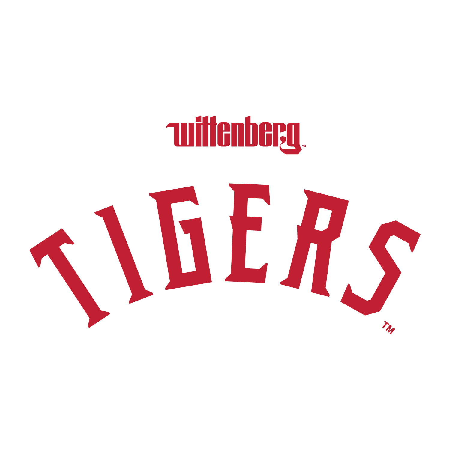 When unable to be grouped with the tiger, this stacked version is a more compact and simplified option of the Wittenberg logo + arching Tigers wordmark. This option is intended more so for external audiences.
The logo can appear in red or white in color documents, red against a light background or white against a dark background. Black is acceptable only in black-and-white documents. The logo must not be violated by overlaid text or graphics, and all surrounding elements must be clear of the logo by 10% of its width. The logo must not be bisected, stretched, or otherwise manipulated in any fashion.